

Leavenworth
Designing a website that turns inspiration into trip planning.
2016
2020
Client
Leavenworth
Industry
Platform
Services
Team
Shane Wilder
Overview
Leavenworth, Washington, is a Bavarian-inspired mountain town in the Cascade Mountains, known for its distinctive character, seasonal events and year-round tourism.
I led design and creative direction for Leavenworth.org — shaping the visual language, information architecture and page systems across the site.
Explore the approach
The challenge
One destination. Many different intentions.
Leavenworth.org had to do more than promote a place. It needed to bring together travel inspiration, lodging, dining, outdoor recreation, events, local businesses, editorial content and practical visitor information — without feeling like a directory.
The challenge was balancing destination storytelling with utility. First-time visitors needed inspiration and a sense of place; others came looking for a restaurant, an event, a trail or somewhere to stay. The system had to support both across a large, constantly changing site without losing the character of Leavenworth.
Design principle
A digital sense of place without sacrificing clarity.
Rather than reproducing Bavarian motifs literally throughout the UI, I used photography, typography, the surrounding landscape and editorial composition to carry Leavenworth’s character. As users move from discovery to planning, the interface shifts from immersive storytelling to denser, task-oriented layouts.
Emotion → Exploration → Information → Action
The beginning of the journey.
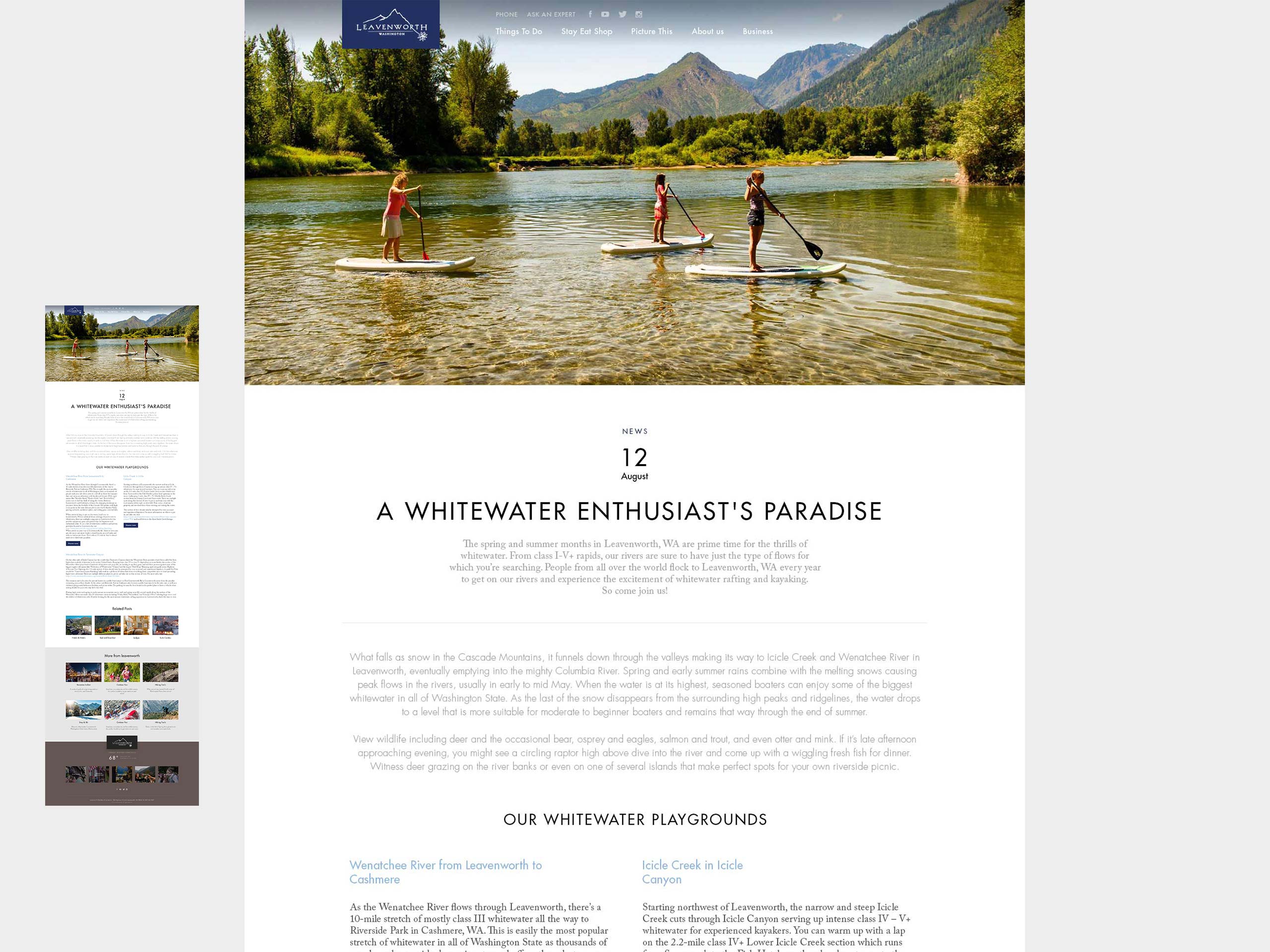
I designed the homepage as a gateway into Leavenworth rather than a traditional promotional landing page. Large-scale imagery creates an immediate sense of place, while modular content moves visitors naturally from inspiration into activities, stories, events and practical trip planning.
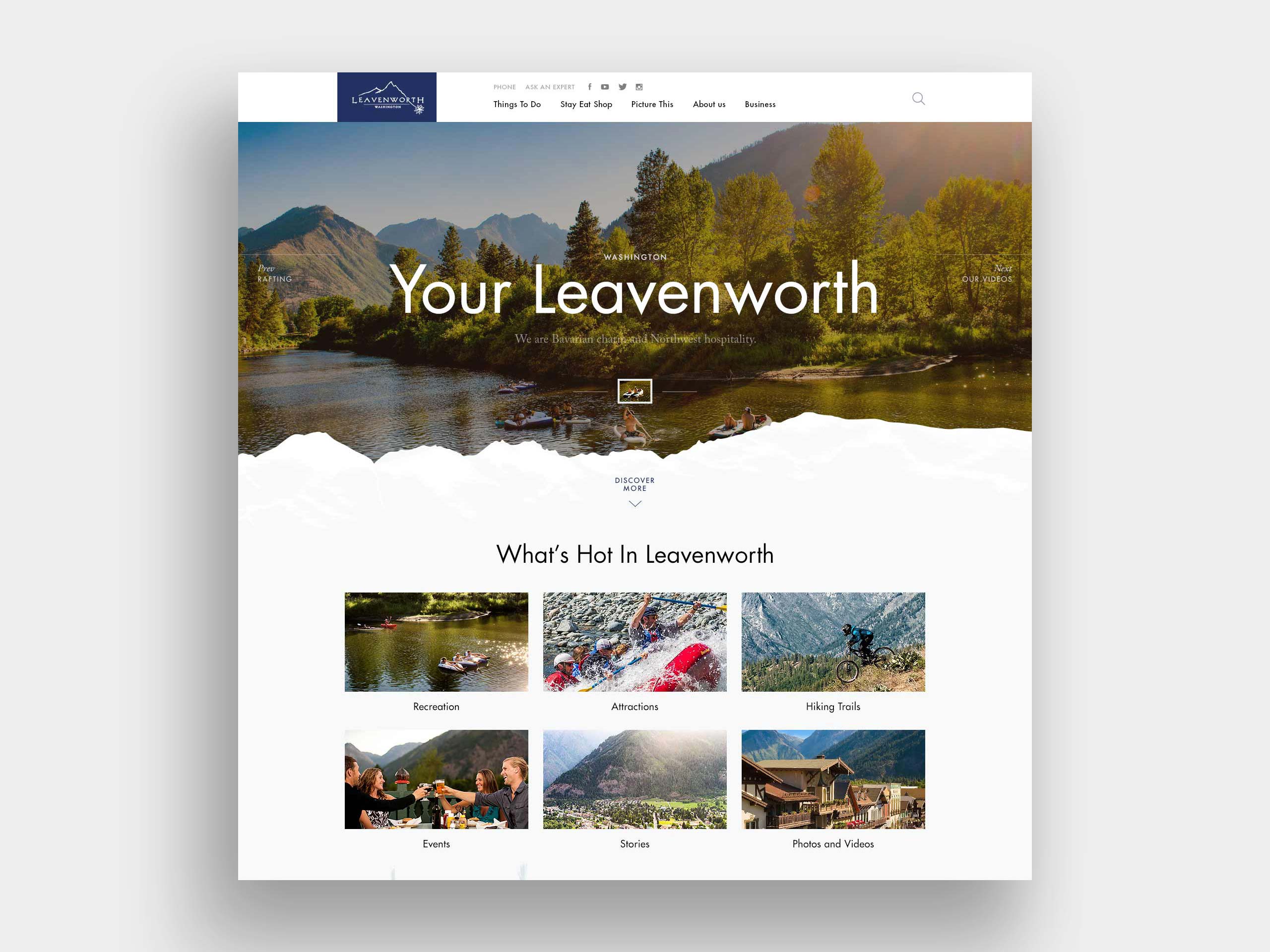
Exploration as navigation.
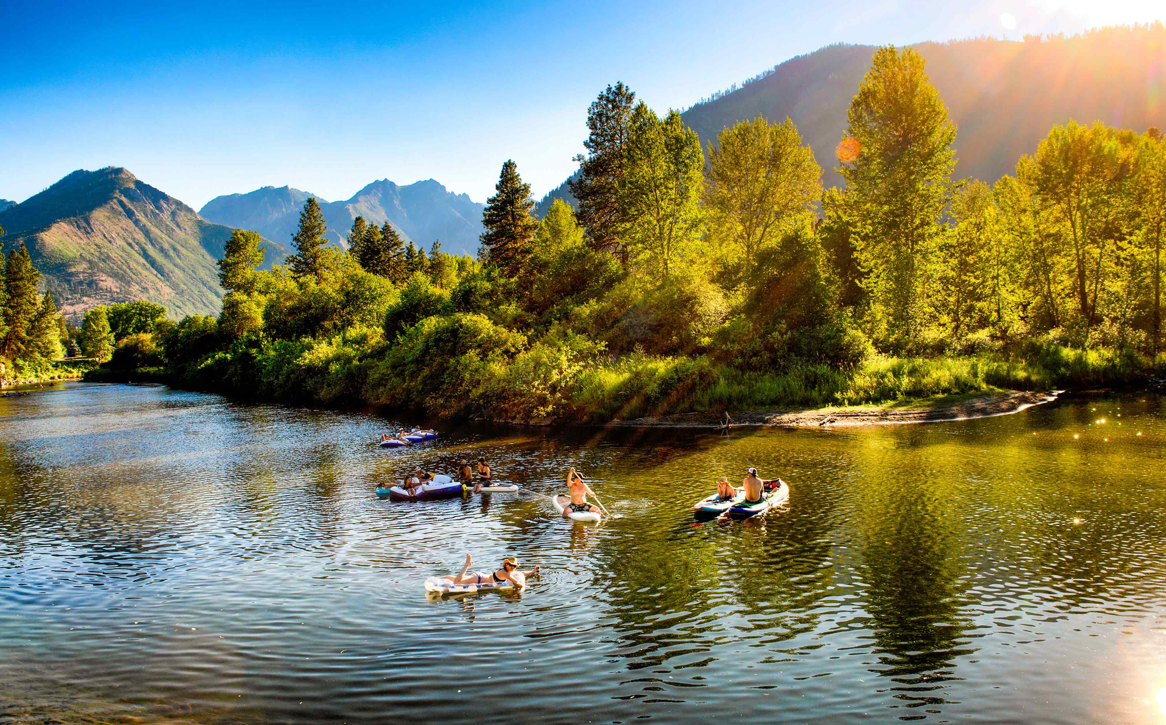
Recreation needed a more visual way to explore. Activities are organized around seasons and experiences, reflecting how Leavenworth changes throughout the year. Photography becomes part of the navigation rather than decoration.
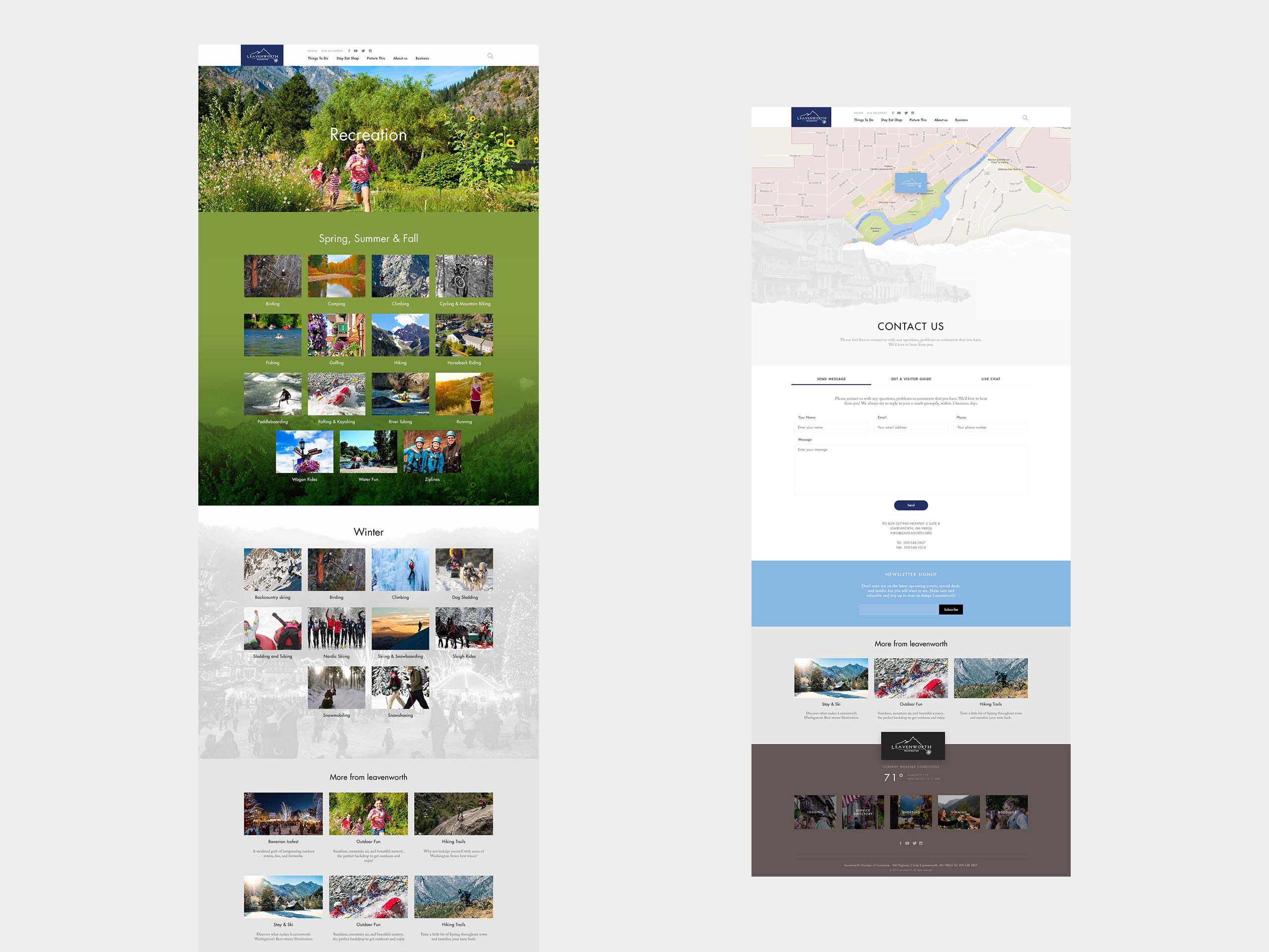
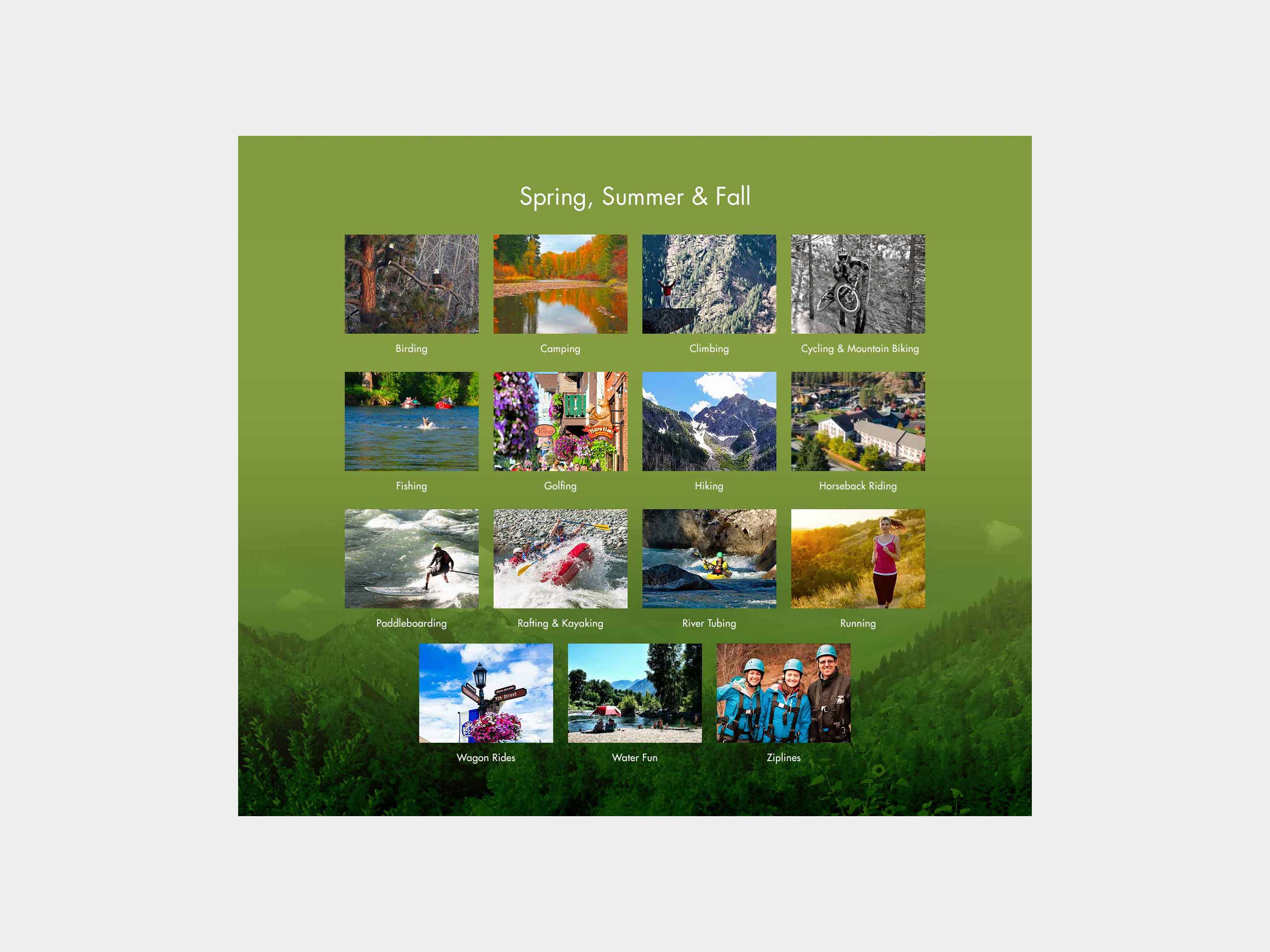
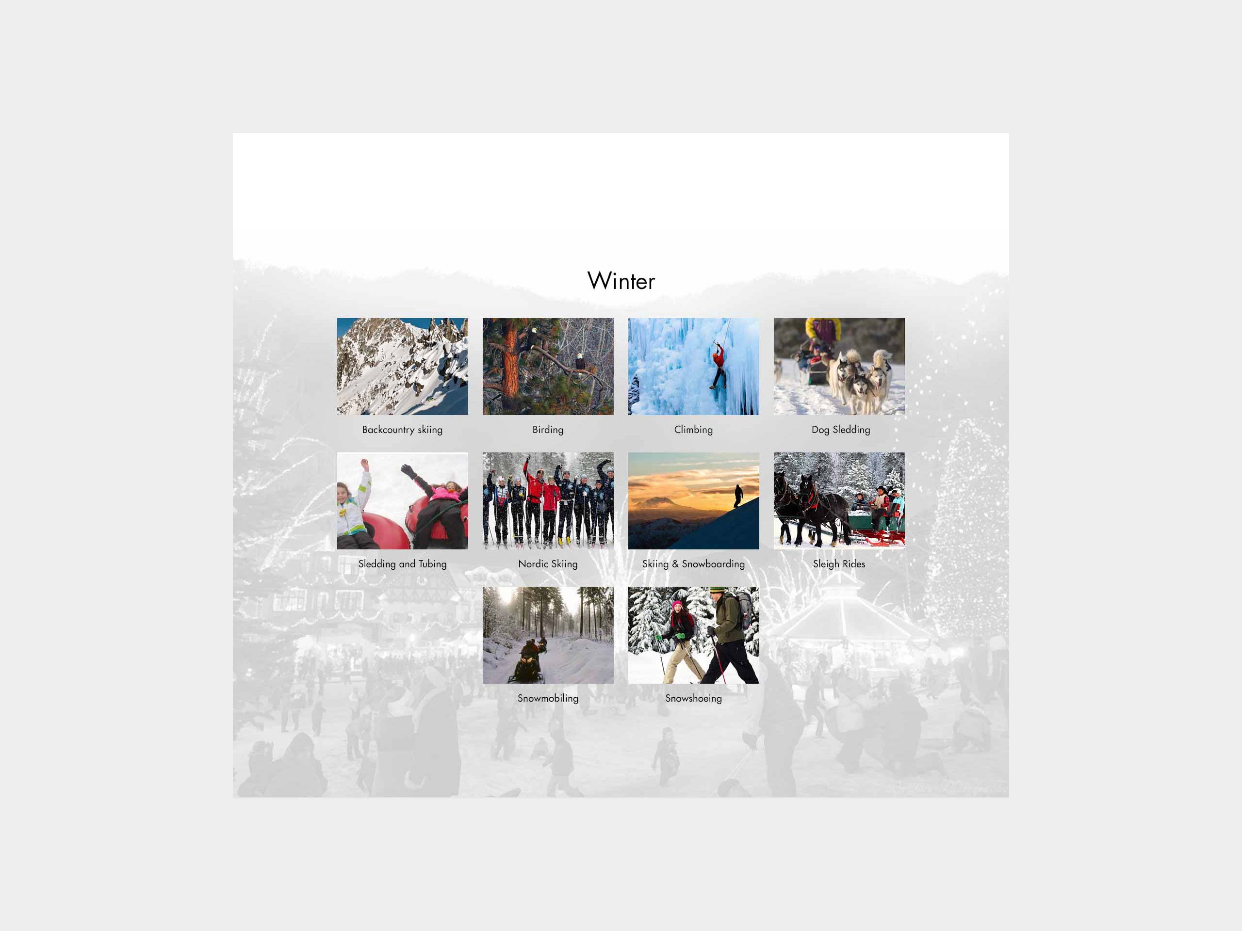
Reducing complexity before the directory.
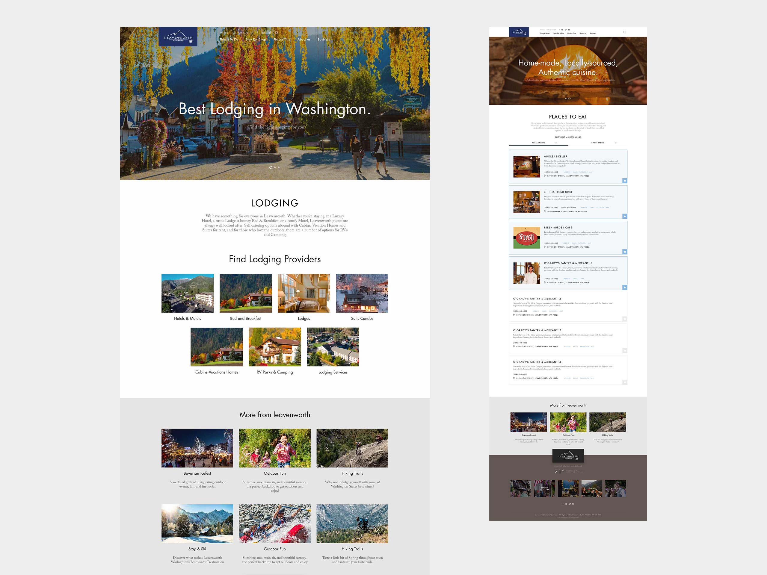
For lodging, I prioritized type of stay before individual providers. Visual categories give users a simpler way into a large set of listings. Dining moves more quickly into structured cards, making options easier to compare and act on.
Making dense information feel lightweight.
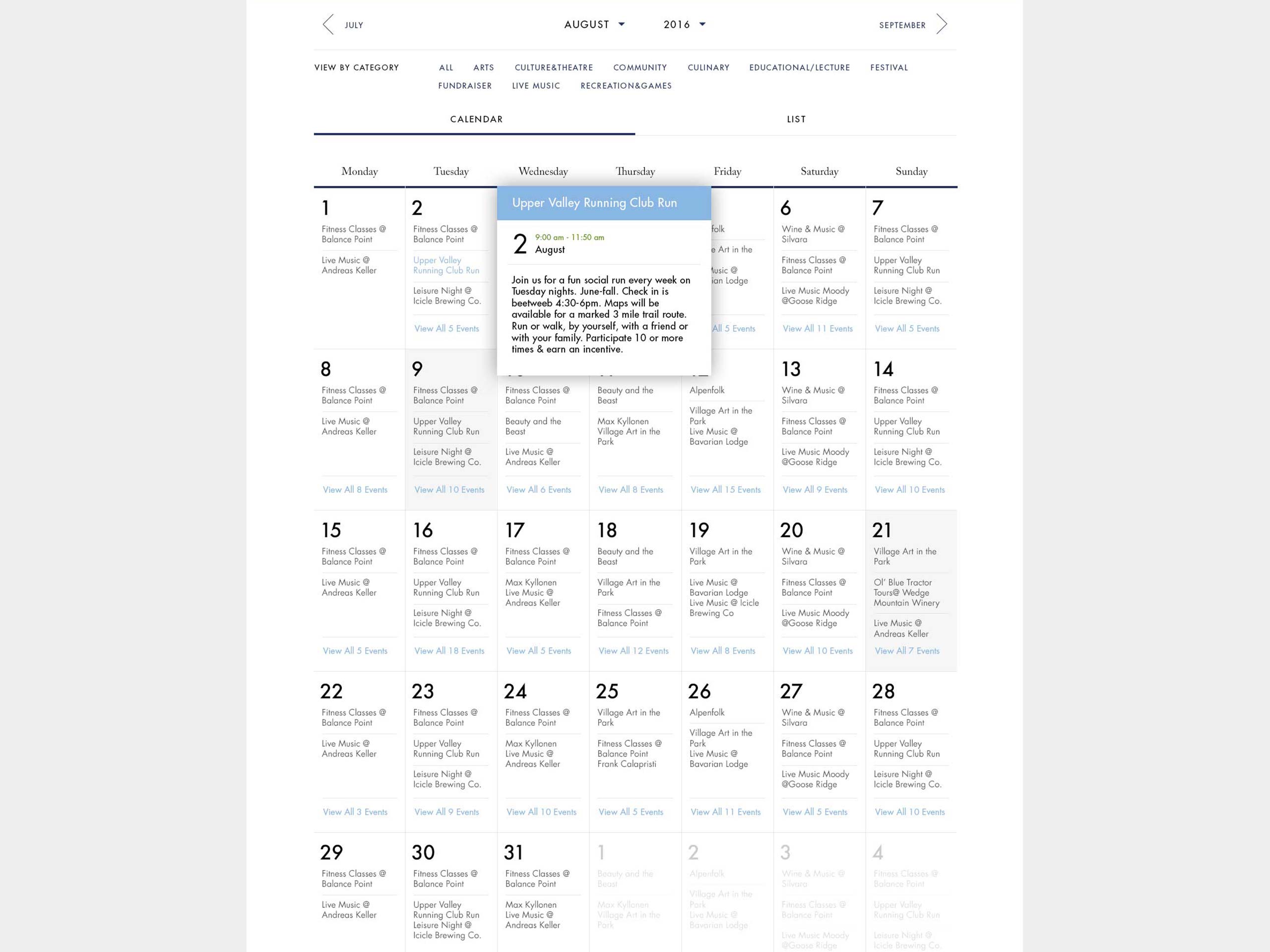
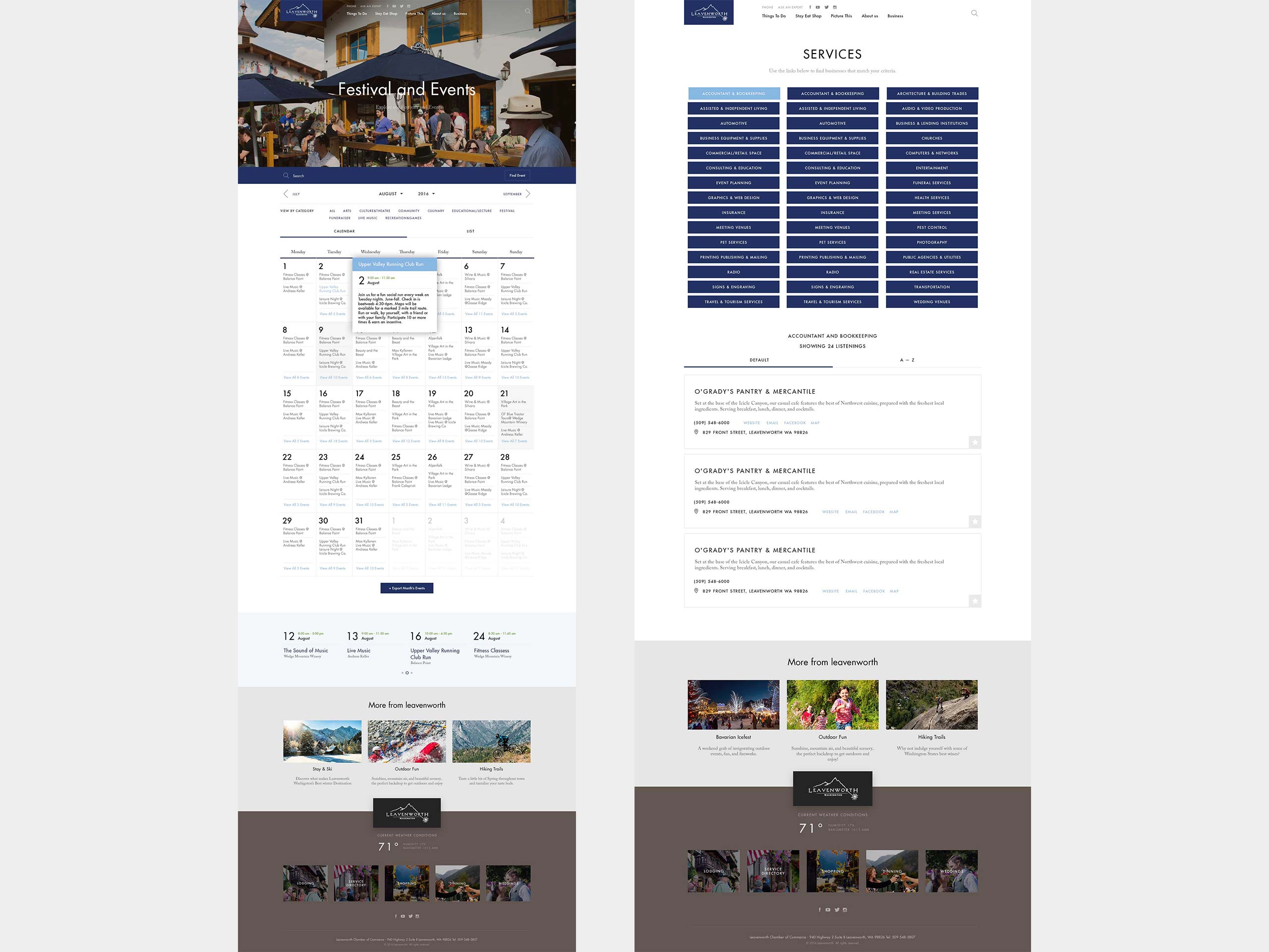
The Festivals & Events section turns a busy calendar into a clear, scannable view of what’s happening and when, helping visitors quickly plan around their trip.
The Services directory organizes local businesses into clear categories and structured listings, helping users move from a broad need to a specific provider.
Both extend the same visual system into denser, more functional interfaces — without feeling like a different product.
Outcome
The final design brought destination storytelling, discovery, local business information, events and practical planning into a cohesive visual framework.
The project moved across very different levels of complexity — from immersive photographic pages to dense calendars and directories — while maintaining a recognizable identity throughout. I led the design and creative direction across that entire range.
Disclaimer:
This project is presented for portfolio and case study purposes only. Leavenworth.org, its trademarks, brand assets, photography, editorial content, and any third-party materials remain the property of their respective owners. No ownership of any third-party content or intellectual property is claimed.
Explore More Work
Realtor.com
Realtor.com
Independent Journal Review
Independent Journal Review
Penguin Random House Website Redesign
Penguin Random House Website Redesign
Tesla Model S Catalog
Tesla Model S Catalog

Stuhrling Original
Stuhrling Original
Discovery Channel TV