

“Simplify” is one of the most common instructions in design. It is usually well intentioned. Products accumulate controls, edge cases, terminology, and historical decisions. Interfaces become harder to scan. Teams respond by removing options, reducing density, shortening flows, or hiding information.Sometimes that is exactly the right move. But simplicity is not the same as quality, and complexity is not automatically a design failure.Many useful products are complex because the work they support is complex. Financial systems contain interconnected data. Real-estate platforms need to represent geography, pricing, risk, market conditions, and property details. Professional tools expose choices because experienced users actually need those choices.
If we treat every sign of complexity as something to eliminate, we can make the interface cleaner while making the product less useful. The goal is not to remove complexity at any cost. It is to make complexity legible.
Complexity and confusion are different problems
A useful distinction is between inherent complexity and accidental confusion. Inherent complexity comes from the domain. There may genuinely be many variables, states, dependencies, or possible actions. Confusion comes from the way those things are organized and presented. A dense interface can be understandable. A minimal interface can be deeply confusing.
The question is not “How much is on the screen?” but “Can the user form a clear mental model of what matters, what is related, and what they can do next?” That puts the design problem in a different place. And, instead of deleting information until the interface feels clean, we can work on hierarchy, grouping, sequencing, terminology, comparison, and context.
Density can be productive
Design discussions often treat information density as inherently negative. For some products, the opposite is true. A user who works in an application every day may benefit from seeing more information at once. Switching between multiple screens, opening repeated dialogs, or hiding every secondary control behind menus can slow down expert work.
The right density depends on the task. A consumer onboarding flow and a professional analytics tool should not be judged by the same visual standard. A product used once a month and a product used eight hours a day have different requirements.
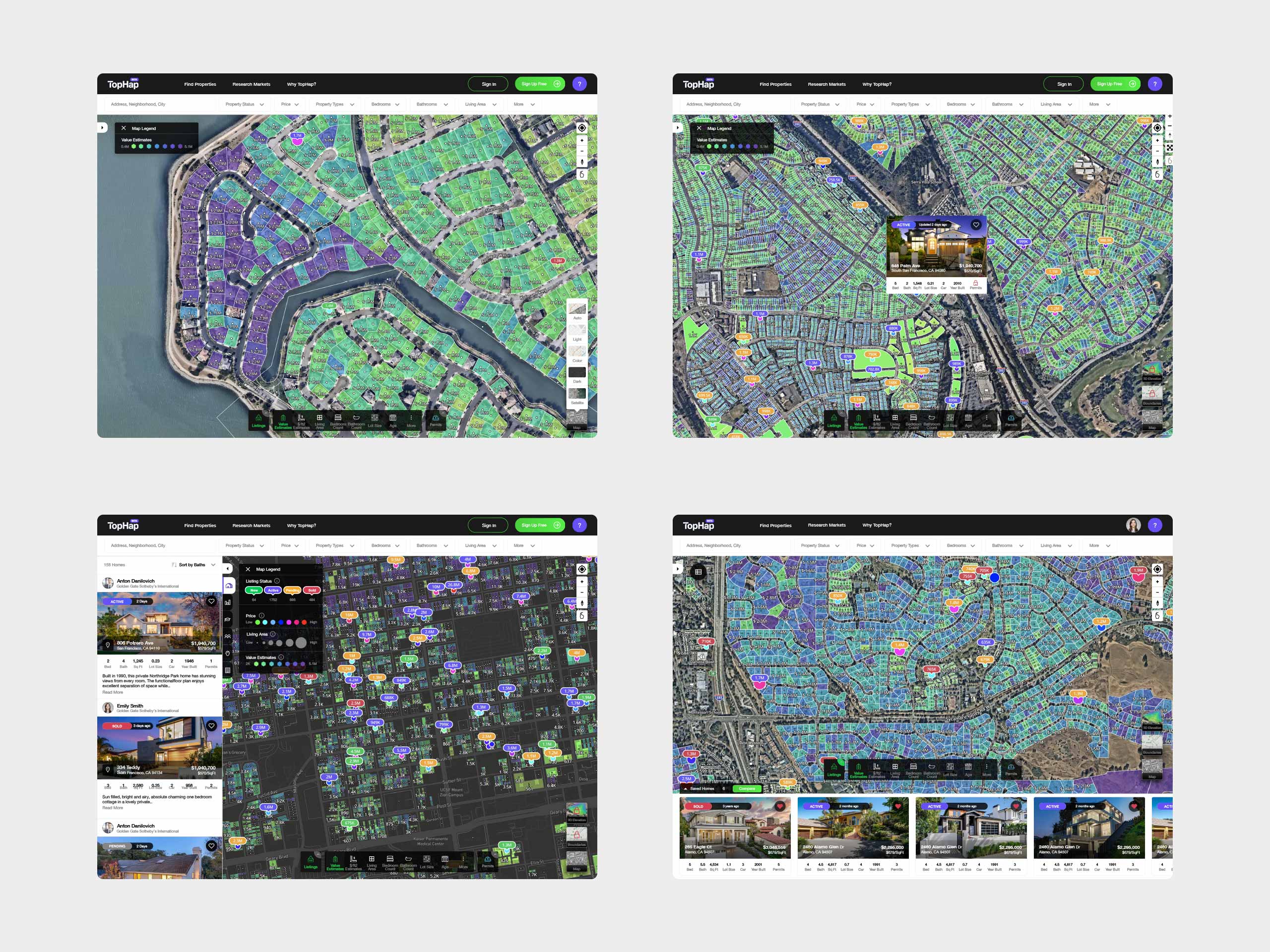
TopHap’s map-first interface combines parcel-level analytics with property listings, valuation data, and interactive search results.
This is why “make it simpler” is not a sufficient design strategy. The more useful question is: simple for whom, at what moment, and for what purpose?
Progressive disclosure is about understanding, not hiding
Progressive disclosure is often interpreted as a visual cleanup technique: show less, then hide the rest behind another click. Used well, it is more powerful than that. It can structure understanding over time. First orient the user and then surface what is relevant. Allow them to compare. Provide deeper evidence when they need it. Make advanced controls available at the point where those controls become meaningful. This sequence is not about protecting a clean interface, it is about matching information to the user’s current question.
A map is a good example. Showing every data layer at once can create noise. Showing only a base map may remove the reason the product exists. The better experience helps the user move between levels: broad patterns, relevant areas, specific properties, detailed evidence.The information is still there. The design creates a path through it.
Context can simplify without removing
One of the strongest ways to make complex information understandable is not to reduce it, but to add the right context. A number by itself often means very little. A home value becomes more useful when compared with similar properties. A metric becomes understandable when shown against its previous value or expected range. A risk score becomes meaningful when the user can see what contributes to it and how significant those factors are. Context turns information into interpretation. This matters because many data-heavy products do not suffer from a lack of data. They suffer from a lack of structure around the data.
Good design helps people answer questions:
Is this high or low? Is it changing? Why did it change? What should I compare it with? What matters here? What can I do next? A product that answers those questions can remain rich without feeling arbitrary.
Good interfaces help people think
The most useful complex products do more than present information efficiently. They support reasoning. They help users detect patterns, compare alternatives, understand cause and effect, and move from observation to action. This is a different ambition from visual simplicity. It means the interface becomes part of the user’s thinking environment. The designer is not merely arranging content. They are shaping how a problem can be understood.
AI makes this increasingly interesting. Intelligent systems can summarize, explain, highlight anomalies, or surface relationships in large information spaces. But AI does not remove the need for information architecture. In fact, without a clear product model, AI can add another layer of ambiguity. The underlying job remains the same: help the user build an accurate understanding.
Simplicity is an outcome, not a style
Some of the simplest experiences are built on top of very complex systems. That simplicity is valuable because the team has understood the complexity well enough to decide what the user needs at each moment. It is not the result of pretending the complexity does not exist. A clean screen is easy to imitate. A clear product is harder. Clarity comes from understanding the domain, identifying meaningful distinctions, designing good defaults, revealing depth at the right time, and preserving the information necessary for informed decisions. The best designers of complex products are not afraid of complexity, they respect it enough to give it structure.